“Don’t judge a book by its cover” is a widely ignored cliché, as many book buyers do just that. In general the advice is (1) ensure the book looks like the kind of book it is supposed to be and (2) in the modern age make sure it works as a website thumbnail.
 My publishers have over the years have for the most part consulted me on my covers, even if it was an ‘does this have your approval’ on a final choice. My first York pottery book was a heap of fun. We’d found several hundred pieces of unused glossy orange samian ware in a pile on the site, so I suggested we simply photograph a heap of pots.
I had three suggestions for the cover of Glint of Light on Broken Glass. The cover designer at Matador seized on one – an abandoned pair of spectacles on a beach. A stock photograph was found that adapted nicely as a cover, with a great use of fonts. But there was one problem; the glasses were clearly modern – 1960’s at the earliest. The glasses in question tumbled from George’s face in 1906 so would have been of the round, Edwardian style with wire frames.
It so happened that the Museum had a pair of replica Edwardian glasses in its ‘handling collection’ (objects that schoolchildren can touch without fear the object will be broken or lost forever). I was due to attend an overnight Archaeologists’ Christmas Party on Lihou Island, so took the glasses along.
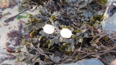
 It was mid afternoon, chilly, with the sun dodging in and out of cloud. I took 40 photographs of the glasses whilst there was still daylight. Guernsey sand is very yellow, so the gold-rimmed frames simply vanished against it. I left the beach and started to climb amongst the rocks. I photographed them sitting on rocks, trapped between rocks, lying in rock-pools, lying in little streamlets with water flowing over them.
When the sun came out, the water sparkled and so did the lenses.  With some fiddling I could catch the bright clouds in one lens – the Glint in the Eye that George notices. No need for photoshopping or clever composure. Lihou’s rocks offered a variety of textures and colours, limpets and weed, shallow puddles, wet and dry patches.
 After an hour I had enough shots – the sun was falling and it was time to return to the party. I sent a shortlisted selection to the designer and the final choice was to desaturate the colours. The image chosen has the glasses upside-down with the arms conspiring to form a heart. On cue the sun is reflecting in the right lens. Perfect.

Leave a Reply